
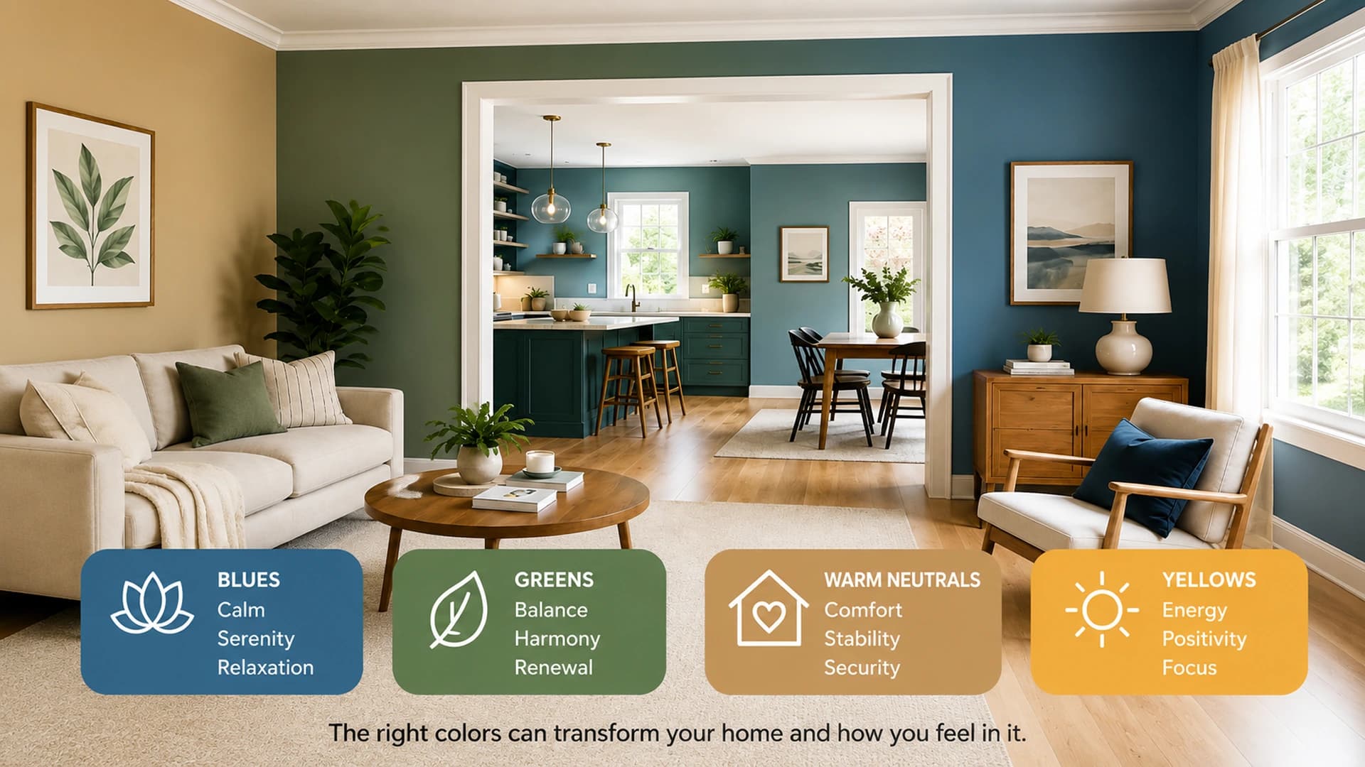
Colour Psychology and How to Use It in Your House
Samvel Petrosov
Jul 05, 2026
4 min read
Published by Envision Carpentry LLC | Last Updated: July 2026
A house becomes a home when the people who live inside it feel comfortable, calm, and at ease — and colour plays a bigger role in that than most homeowners realize. Walk into one room and it feels calm. Walk into another and it feels lively. That shift rarely comes from furniture or decor alone. More often, it comes from the colour on the walls. This is colour psychology: the study of how colour shapes mood, energy, and behaviour in the spaces we spend most of our time in.
Colour doesn't just set up a tone — it can influence productivity, comfort, focus, and even how a buyer perceives a home when it's time to sell. The right shade, in the right room, does more work than most people give it credit for.
We Spend More Time at Home Than We Think
Home is where ordinary life happens. Morning coffee. Late night conversations. Kids finish homework at the dining table. A quiet afternoon with a good book. Because these moments repeat every single day, the atmosphere around them matters more than it seems at first glance.
Living with a colour is very different from looking at it on a paint sample for thirty seconds. The shade you choose today becomes part of your everyday routine tomorrow — the backdrop to thousands of ordinary moments.
Well-considered colour choices don't just affect mood — they affect how a home is remembered. Real estate research consistently shows paint colour ranks among the top factors buyers weigh when deciding whether to make an offer.
The Science Behind Colour Psychology
Colour psychology isn't just designing folklore — it's rooted in how the brain processes visual information. Certain wavelengths of light trigger measurable physiological responses: shifts in heart rate, blood pressure, and even hormone activity. That's why a soft blue bedroom can feel genuinely calming rather than just aesthetically pleasing, and why a bright, saturated colour in a small space can feel mentally tiring after a while.
Cooler tones — blues, soft greens, muted neutrals — tend to lower arousal and support relaxation, focus, and rest. Warmer, more saturated tones — reds, oranges, bold yellows — tend to raise energy and stimulate conversation and appetite, which is exactly why they show up so often in social and dining spaces.
This matters beyond aesthetics. The colours around us have been linked to changes in productivity, focus, and even how comfortable people feel socializing in a space. Understanding this cause-and-effect relationship is what turns a paint choice from a guess into a decision — and it's the bridge into which colours actually work best, room by room.
Some Colours Invite You to Slow Down
Think about the places where you naturally relax. They rarely feel loud. Gentler, softer colours often create a calm environment without demanding attention. That doesn't mean every room should look the same — some spaces are meant to feel energetic, others peaceful. The purpose of the room matters just as much as the colour itself. Paint should support how a space is used, not just decorating it.
| Colour | Psychological Effect | Best Rooms |
|---|---|---|
| Soft Blue | Calming; linked to lower blood pressure and heart rate | Bedroom, Bathroom |
| Sage Green | Promotes harmony and relaxed social interaction | Living Room |
| Warm Beige / Khaki | Grounding and welcoming | Whole Home |
| Deep Charcoal / Brown | Sophisticated and cozy | Accent Walls, Cabinetry |
| Bright Red | Increases tension — current buyer data shows it performs worst in bathrooms | Use sparingly, especially in small spaces |
| Ochre Yellow | Polarizing — buyer reception varies by shade and room | Test carefully before committing |
Supporting Research: What Studies Say About Colour and Human Behaviour
The room-by-room guidance above isn't just intuition — it lines up with what behavioural research has found:
Soft blues and reduced stress: Blue tones have repeatedly been associated with lower blood pressure and heart rate, which is part of why they're a common choice for bedrooms and bathrooms — spaces meant for winding down.
Green and social interaction: A University of Georgia study found that rooms painted in sage green led to longer, more meaningful social interactions among occupants, reinforcing green's reputation as a harmony-promoting colour for living rooms and shared spaces.
Neutral colours and familiarity: Warm beiges, khakis, and muted neutrals create a sense of comfort and familiarity throughout a home, which is one reason they perform consistently well across nearly every room type.
Together, this research supports the room recommendations above — and sets up the next question homeowners actually care about: does any of this show up in real dollars when it's time to sell?
How Paint Colour Affects Home Value (And By How Much)
Zillow's 2026 Homebuyer Findings
| Room + Colour | Estimated Offer Impact |
|---|---|
| Bedroom — Chocolate Brown | +$2,277 |
| Living Room — Pale Blue | +$1,723 |
| Living Room — Charcoal Gray | +$1,509 |
| Kitchen — Charcoal Gray | +$1,373 |
| Living Room — Sage Green | +$471 |
| Bathroom — Blush Pink | −$6,013 |
| Bathroom — Bold Red | −$7,971 |
According to Zillow's 2026 Paint Color Analysis, which surveyed roughly 4,200 recent and prospective homebuyers nationwide, paint colour can shift a home's offer price by hundreds or even thousands of dollars. Chocolate brown bedrooms and pale blue living rooms drew the strongest gains, while bold colour choices in bathrooms carried the steepest penalties — red bathrooms brought offers down by nearly $8,000.
The pattern echoes prior years' findings: buyers consistently reward grounded, muted tones and penalize anything loud in a small, high-visibility room like a bathroom.
Why Every Paint Brand Chose Calm Over Bold This Year
The latest colour selections from major paint brands reinforce what colour psychology has suggested for years: homeowners are gravitating toward comfort, warmth, and stability.
Sherwin-Williams — 2026 Colour of the Year: Universal Khaki, an earthy neutral that sits between beige and taupe with a subtle green undertone.
Benjamin Moore — 2026 Colour of the Year: Silhouette, a sophisticated neutral blending rich espresso brown with soft charcoal undertones.
Behr — 2026 Colour of the Year: Hidden Gem, a smoky jade green described as grounded yet energizing.
2026's biggest colour trend isn't a colour at all — it's calm. Every major paint brand this year chose grounded, earthy neutrals over bold statement shades, which lines up exactly with what colour psychology tells us about how people want their homes to feel right now.
Natural Light Changes the Conversation
A colour at noon may not look the same after sunset. Windows bring different amounts of light into every room, and the direction a room faces changes its appearance throughout the day. North-facing rooms tend to receive cooler, flatter light, which can make warm colours look muted and cool colours look even cooler.
South-facing rooms get warmer, more direct light, which can intensify a colour's brightness. Even the same paint can feel warmer in one room and cooler in another.
That's why experienced home painters never rely on a paint chip alone. Testing a sample directly on the wall — and checking it in both morning and evening light — is the only reliable way to know how a colour will actually live in a space. The room itself always has the final say.
The Right Choice Is Personal
Trends are helpful. Psychology provides guidance. But every family uses their spaces differently, and personal preference still matters more than any single data point. A family home feels different from a downtown apartment.
Someone working from home may want a completely different atmosphere than someone designing a guest room. What feels welcoming to one homeowner may not suit another at all. The best colour is usually the one that fits the people living there — not simply the one everyone else is talking about.
Colours Work on the Mind More Than We Realize
Colour psychology shows up in places most people never stop to notice. Restaurants, for example, rarely use blue as a dominant dining-room colour, because very few natural foods are blue — so the colour doesn't trigger the same appetite response that warm tones do.
Designers lean instead on warm reds, oranges, and earthy tones to encourage comfort and appetite. It's a small, deliberate choice that shapes how people feel in a space without them ever realizing why.
The same principle applies to home. The colours around you are quietly shaping mood, energy, and behaviour every day — whether you've ever thought about why.
Bringing Colour Psychology Into Your Home
Colour affects mood. It influences how space functions day to day. It can shift how buyers perceive a home when it's time to sell. And natural light changes how every one of those effects actually shows up on your walls.
None of this replaces personal taste — it simply gives you a better-informed starting point. The best colour is still the one that supports how you want to live.
Whether you're refreshing a single room or repainting your entire home, understanding colour psychology can help you create spaces that feel more comfortable, functional, and welcoming every day. Ready to find the right colour for your home? Talk to our experienced home painters for a free colour consultation.
Frequently Asked Questions
The most common questions from this article, organized in a cleaner format so the section actually feels like an FAQ.
Yes. Zillow's 2026 analysis of roughly 4,200 homebuyers found that paint colour can shift offers by hundreds or even thousands of dollars — a chocolate brown bedroom added an estimated $2,277, while a bold red bathroom lowered offers by nearly $8,000.
Bold, saturated colours perform worse in bathrooms specifically. Zillow's 2026 data found bold red bathrooms lowered offers by nearly $7,971, and blush pink bathrooms lowered offers by about $6,013 — the steepest penalties in the entire study.
Yes. The same colour can look warmer in evening light and cooler or more muted in morning light, especially in north-facing rooms. That's why it's best to test paint on the actual wall rather than relying on a swatch alone.
Earthy, grounded neutrals are leading 2026's colour trends across every major paint brand — Sherwin-Williams' Universal Khaki, Benjamin Moore's Silhouette, and Behr's Hidden Gem. The shared theme is calm over bold, which lines up with what colour psychology says people want from their homes right now.